What a website actually does for a small business
Most owners are told they need a website without ever being told what it is supposed to do. Here is the honest version.
There is a version of this conversation that goes badly. Someone calls a business owner, tells them their business is invisible online, and quotes four thousand dollars to fix it. The owner has been booked solid for six years on referrals alone. Nothing about that call is useful to them, because it never explains what the website is actually for.
So here is the useful version. A website does not create demand. It does not make the phone ring on its own, and it will not replace the neighbor who tells someone you did good work. What it does is catch the people who already heard your name and want to check you out before they call.
The gap between the referral and the phone call
Think about what a referral actually looks like now. Someone mentions you at a barbecue. The other person nods, and two days later, sitting on the couch, they type your name into their phone. That moment is the entire job of your website.
If nothing comes up, or what comes up is a Facebook page last updated in 2019, the referral does not die exactly. It just gets weaker. They might still call. They might also keep scrolling to the next name, because the next name had a page that answered their questions in ten seconds.
The website is not competing for attention. It already has attention. It is competing with doubt.
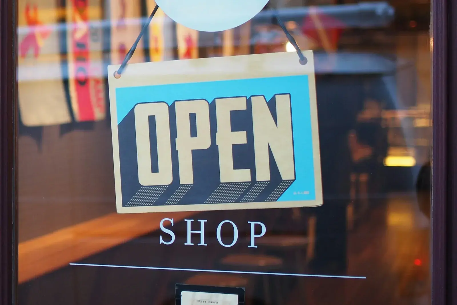
What people are looking for in the first ten seconds
When someone lands on your site after hearing your name, they are not reading. They are scanning for a small number of specific things, and they are doing it on a phone, usually one-handed.
- Is this the right kind of business? They want the trade named plainly, not a slogan about passion or excellence.
- Do they cover me? A town, a county, a service radius. If someone has to guess whether you come out to them, some of them will not call to find out.
- Is this a real operation? Photos of actual work, a real address or service area, a phone number that is a link they can tap.
- What does working with them look like? Do you quote free, do you charge a call-out fee, how fast do you get back to people.
- Can I reach them right now? The number should be visible without scrolling.
That is close to the whole list. Notice that none of it requires clever writing. It requires being specific, which is harder and cheaper.
The parts people pay for that do not move anything
This is where a lot of money goes for no return. A few of the usual ones.
Animation everywhere. A page where every section slides in as you scroll feels impressive to the person who commissioned it and feels slow to everyone else. One considered moment is worth more than fifteen scattered ones, and on an older phone the scattered version stutters.
A long About page written in the third person. Nobody arrives wanting your origin story. If you are a solo operator, a short paragraph in your own voice with a real photo does more than four hundred words about your commitment to quality.
Stock photography of people who do not work for you. A generic photo of a smiling model in a hard hat is worse than no photo, because the visitor has seen that exact image on three competitor sites. A slightly imperfect phone photo of your actual crew on an actual job outperforms it every time.
Pages nobody asked for. A blog you will not update, a testimonials page with three vague quotes, a services page per service when you only have four. Every page you add is a page that has to be maintained and a page that can go stale.

Speed is a feature, and it is the one people skip
A slow page loses the visitor before the design is ever seen. That is not a design opinion, it is just what happens on a phone on a weak signal in a parking lot, which is where a good number of your visitors actually are.
The usual culprits are large uncompressed images, a pile of third-party scripts for tools nobody looks at, and font files loading in a way that blocks the page. None of that is visible to the person who paid for the site. All of it is visible to the person trying to use it.
What good enough actually looks like
For most local businesses, a single page does the job. The trade and the area at the top, the phone number in the header, a few real photos, a plain list of what you do, your hours and location, and a short note about what happens after someone gets in touch. That is a site that earns its keep.
If you take one thing from this: the goal is not to have a website. The goal is that the person who already decided to look you up finds nothing that gives them a reason to hesitate.
Keep reading
- What a website actually costs, and what you are paying for
Nobody publishes a price, which makes it hard to tell a fair quote from a bad one. This is the structure behind the number, what moves it, and which parts are worth paying for.
- The first five minutes after a lead comes in
Most of what decides whether an inquiry turns into work happens before you have said a word to anybody. This is the part of lead generation nobody sets up, and it costs more than any ad.
- Local Services Ads, and whether your trade can even get them
The listings above the ads with the green check are not something you can just switch on. Here is what Google Guaranteed actually is, what the screening involves, and why plenty of trades cannot get it at all.
- Google Ads or SEO, and why the answer is usually both for a while
One of them rents you the top of the page today and stops the day you stop paying. The other takes months and then keeps working. This is how to sequence them when you cannot afford to do everything at once.
- Where your Google Ads budget actually goes
Most wasted ad spend is not bad ads. It is paying full price for searches that were never going to become a customer. Here is what those searches look like and how the money comes back.
- What actually counts as SEO on your own website
Your Google Business Profile can be complete and the website behind it can still be invisible. This is the slower half of SEO, the part that happens on the pages themselves.
- Signs your website is quietly losing you customers
A website does not have to be broken to be losing you work. Here is how to actually check yours, in the few minutes most owners have never spent on it.
- How small businesses actually scale with ads
Ads are not a switch you flip. This walks through what has to be working before you spend a dollar, whether you are chasing leads or orders, and why the first month almost always costs more per sale than the third.
- Your Google Business Profile is doing more work than your website
For most local businesses the map listing decides who calls, not the website. This covers what actually sits in that panel and why the parts most owners skip are the ones that move you up.